Gandel Foundation Rebrand
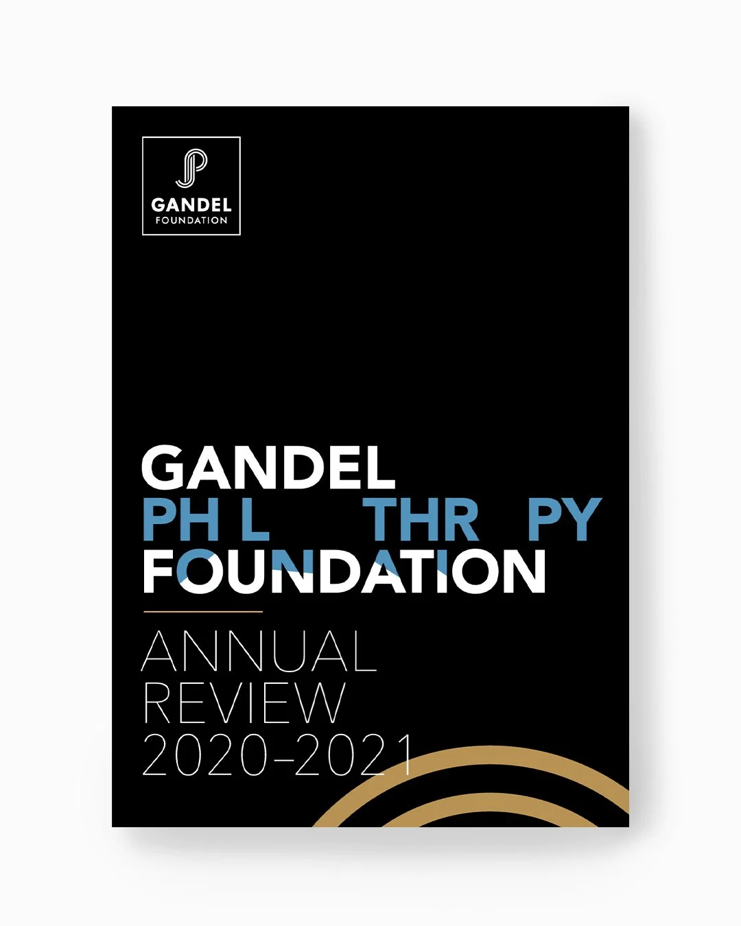
The logo was thoughtfully redesigned for Gandel Philanthropy in 2021, coinciding with their official name change to Gandel Foundation. The intertwined letters in the JP motif featured in the new logo represent the founders' initials and draws inspiration from knot symbols and designs found in many cultures, which traditionally symbolise eternity and longevity. This careful rebrand marked a significant update in their visual identity, aiming to better reflect their evolving mission, values, and commitment to lasting impact.